About This Project
A new identity
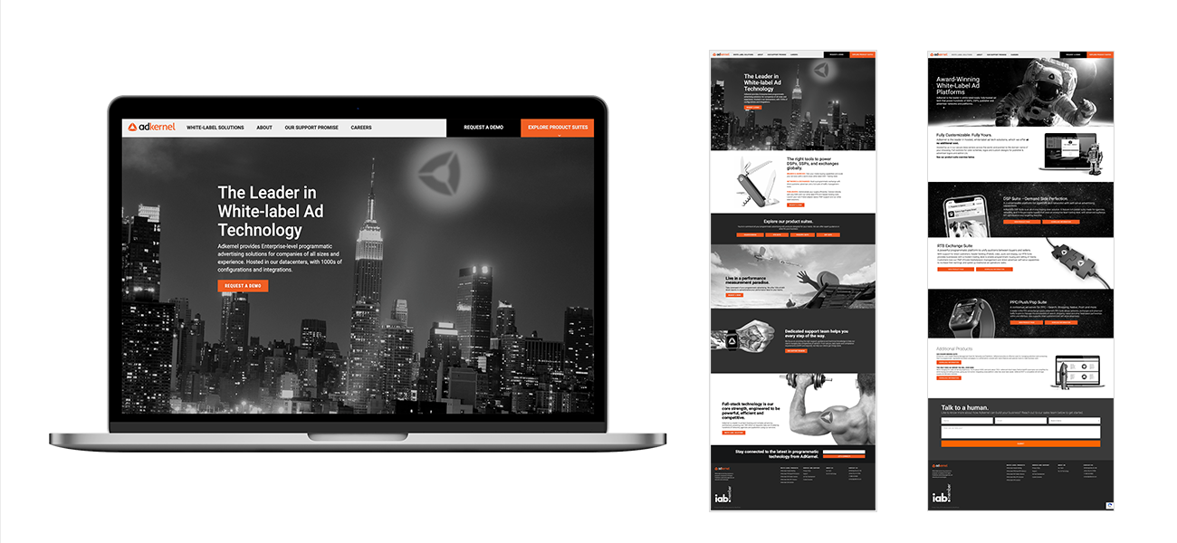
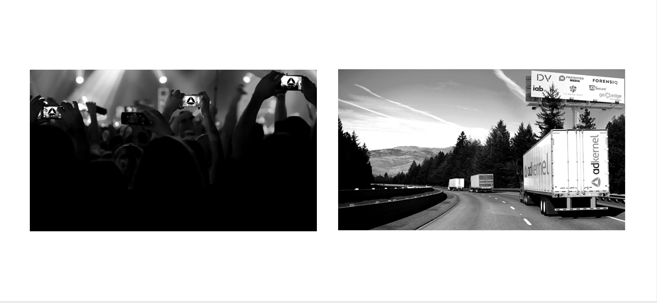
The brandmark for Adkernel is derived from the shape of a cut-away section showing “earth’s core” to illustrate its depth. Simultaneously, the imagery delivers the brand’s presence everywhere, in a more approachable way.
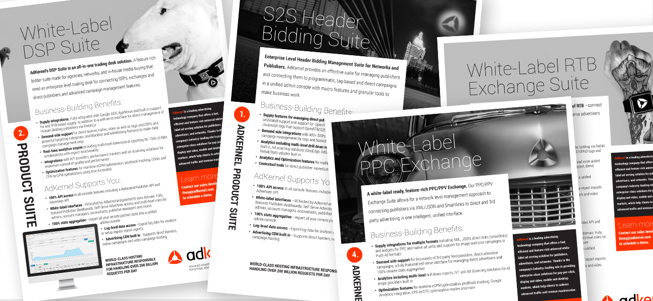
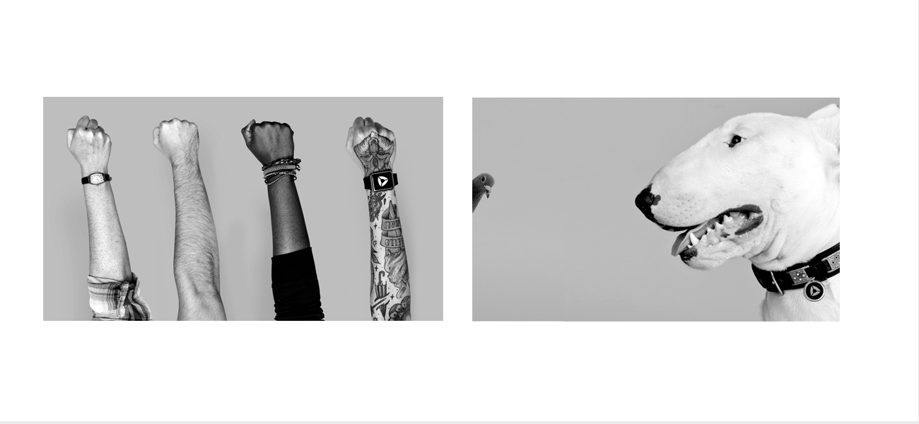
One of the largest problems of companies in a niche category is parity. Everyone is looking at everyone else’s downloaded website template. This is creating a lot of visual parity, especially those in the technology sector are looking alike. Remove the logo from their website and see if you can tell which one is which. I saw an opportunity to create a visual language for AdKernel the would differentiate the brand from their competitors at a glance by adding personality to a category that only relies on stock photography to get its brand message across.
Date
February 22, 2016
